Return To A Claim
Introduction
- Organisation:
- Ministry of Justice
- Sector:
- Public
- My role:
- UX Designer
- Responsibilities:
- Workshop facilitation, interaction design, prototyping
- Phase:
- Beta
The problem
Applying for criminal injury compensation is a long process that forces users to think about traumatic events in their lives. There is currently no way to save your progress and resume later. Applications must be completed in one sitting.
As a consequence, users who get interupted often have to restart the process from the beginning, causing serious frustration. How might someone save their progress and resume their application later?
Two models
I knew that there were two broad strategies to solving this problem for users:
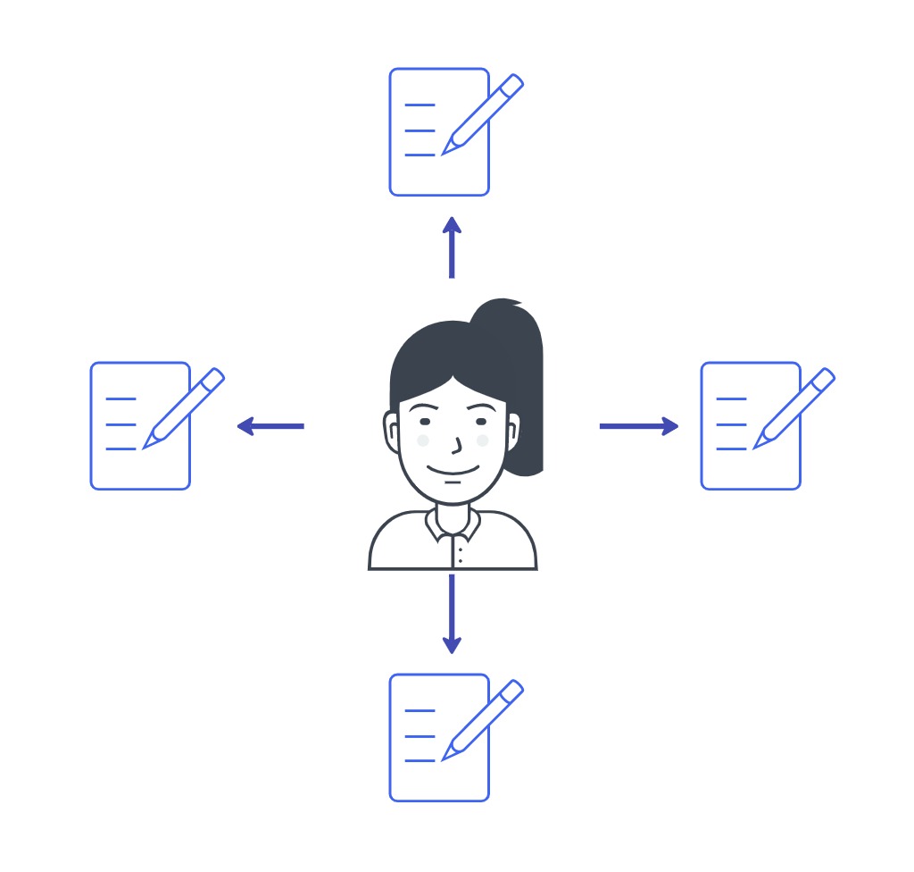
- A per-application model:
Allow users to save their application progress as a self contained artefact. Users with multiple applications would have to access each application independently, in different places, without being connected. - A per-user model:
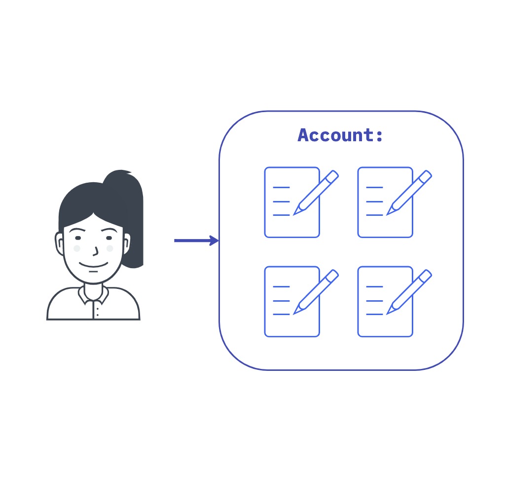
Allow users to save and manage all their applications in one place via an account.
Per application
Per user
Per application model
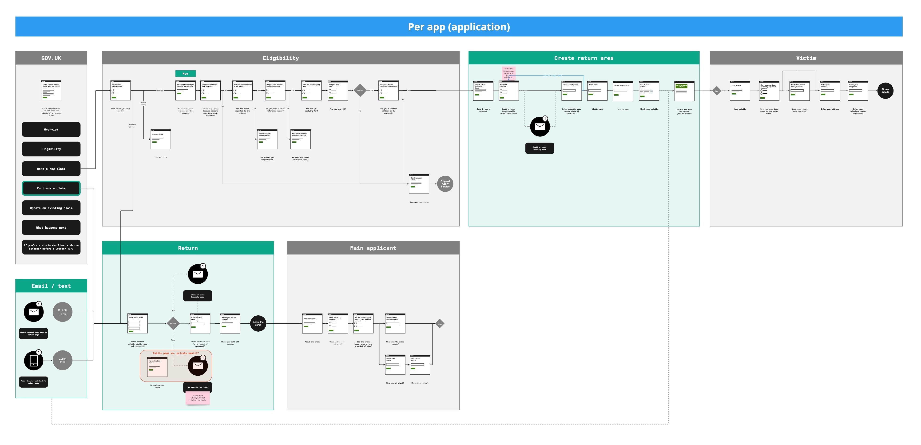
In testing this solution, users incorrectly assumed that applications were associated with their account, so assumed they could sign back in to continue. We also found it challenging to write content that avoided terms like ‘sign in’ even though it seemed like this is what was happening. This made us reevaluate the approach altogether.
I was aware that a government-wide single sign on solution called 'Gov One Login' has started to be rolled out. On top of this, another one of our user groups — third party reps — would likely struggle to manage multiple applications via email. I persuaded the team to opt for an account based solution, which would be more flexible for our various types of users and their respective needs. So conversation began about integrating with Gov One Login.
Per user model
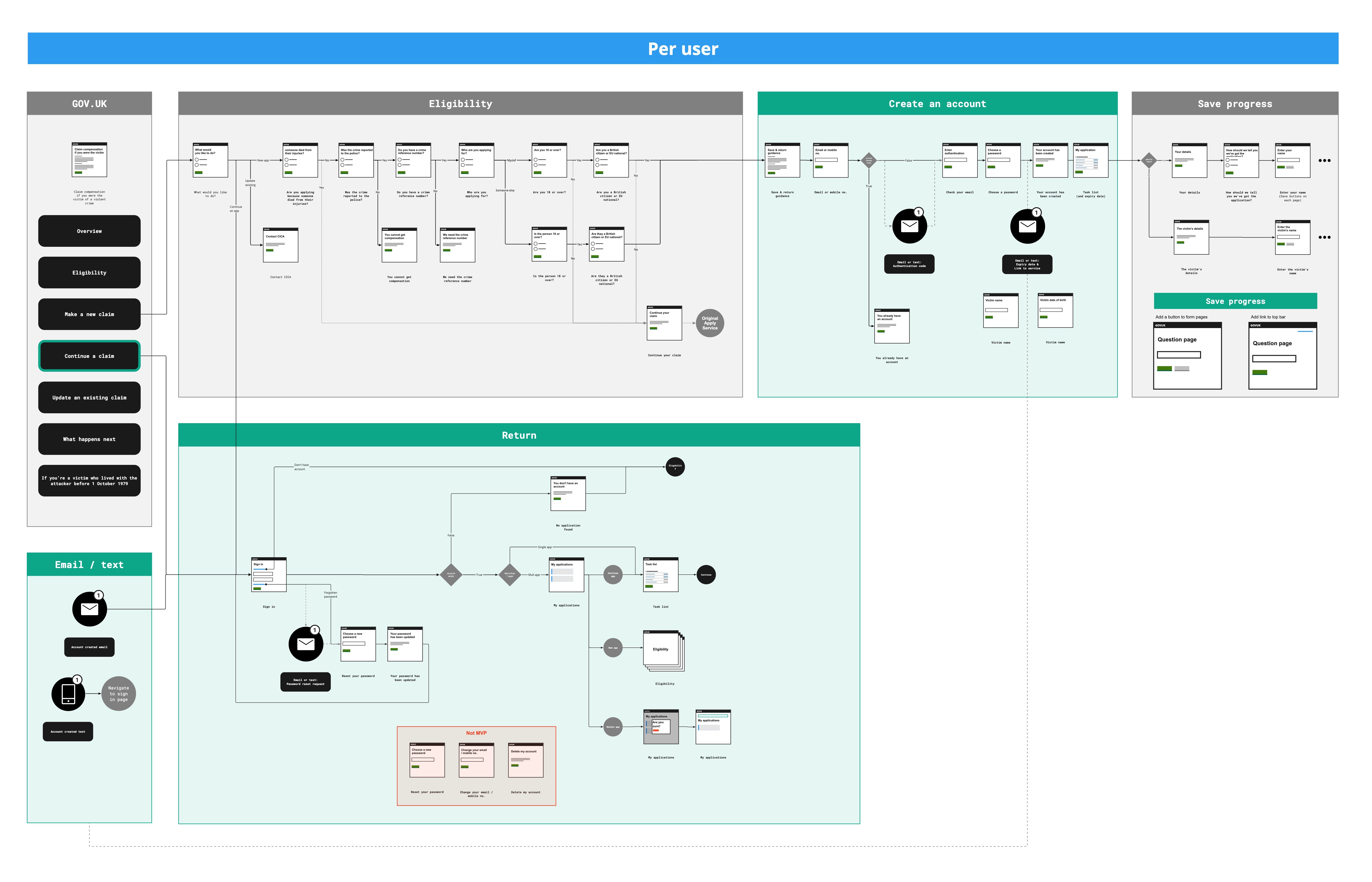
This iteration plays into people’s mental models that their application is associated with an account—an incorrect assumption that people made when we tested version 2. This solution links the application up with GOV.UK One Login, so we wouldn’t need to build our own account solution.
For these reasons, we chose to take the per-user model forward, so I began specing out an MPV for an account based solution.
Designing an MVP
The first round of MVP testing for this prototype revealed that people struggled to return to the application due to the fact that there is no ‘continue an application’ page on the stepped guidance. We also found that people expected their current page (form info) to be saved when they clicked the ‘save and come back later’ link.
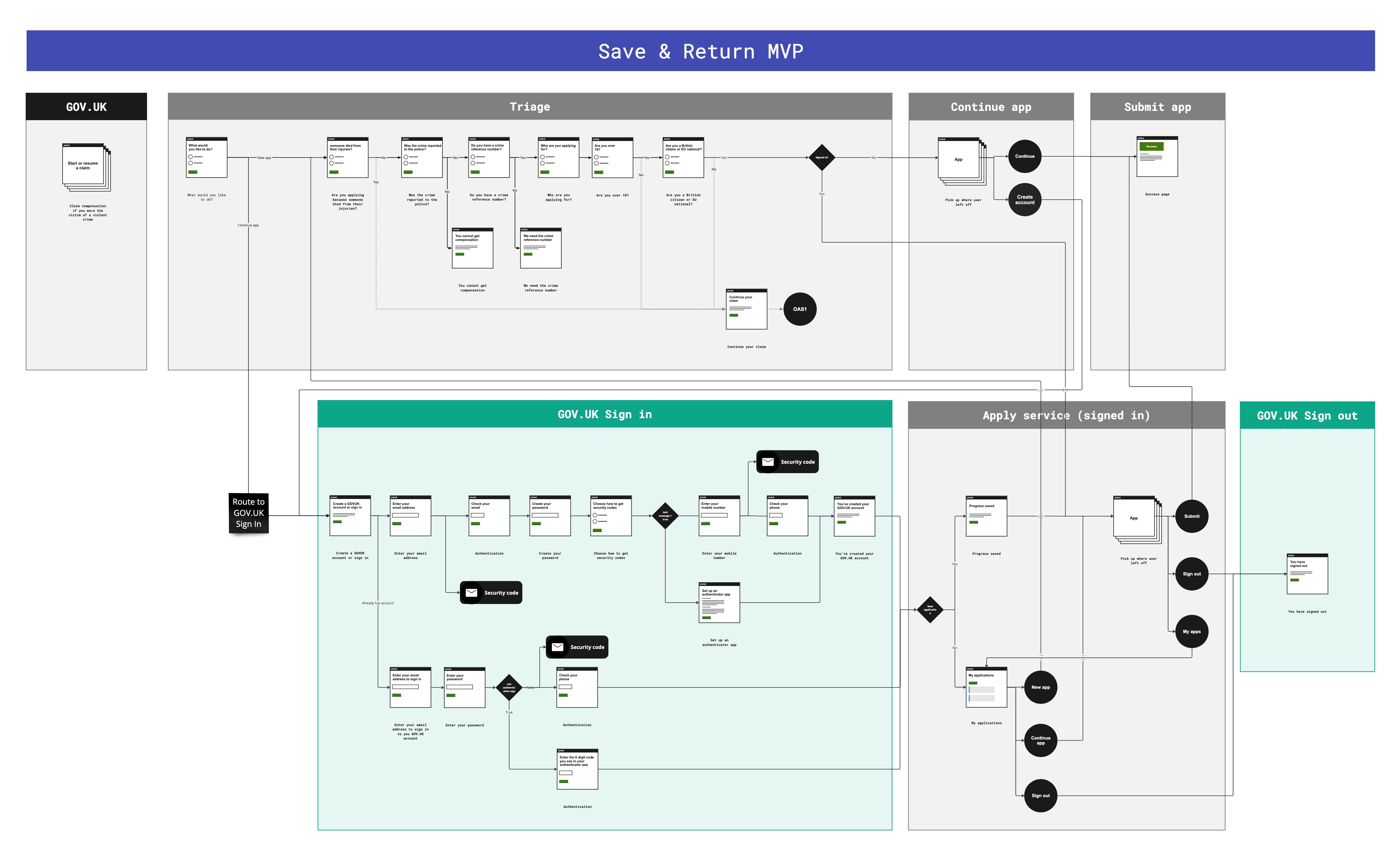
Interaction design
Saving an application
The 'save problem'
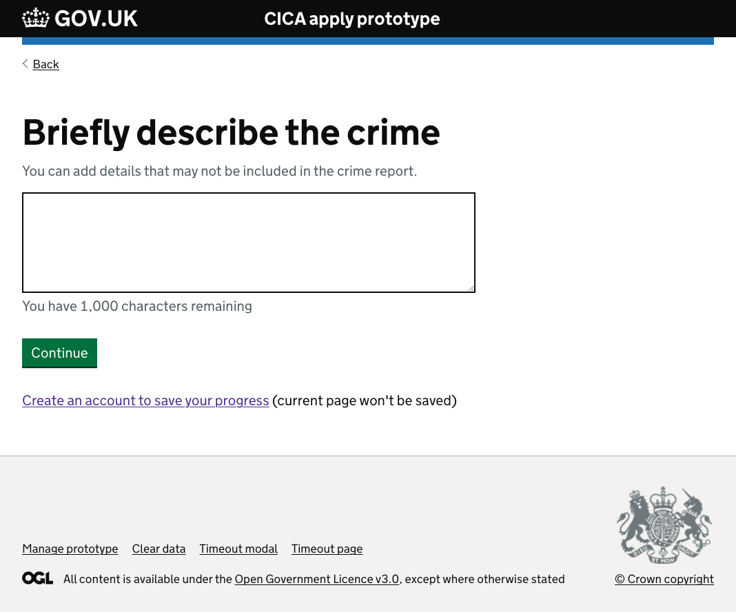
One difficulty we had was that the 'save' link would not submit any data on the page it was clicked on. This is because links don’t submit forms. For most pages, this would not be a problem because only small pieces of user-entered data would be lost. However, we had some long textarea fields for users to describe the crime, which can be quite traumatic. For this reason, we needed to find a way to stop users losing their long answers.
One way of solving this problem would be to replace the link with a button. However, this would introduce the further problem of not allowing users to start the save journey if the current form was empty, because an error would be thrown, forcing them to type an answer. In testing, we noticed users commonly start the save journey by clicking the link on a page they haven't filled, and we didn't want to confuse this expectation. It would also create problems for users that get interrupted and need to quickly save their progress. So, I came up with some alternative options:
Add more link text
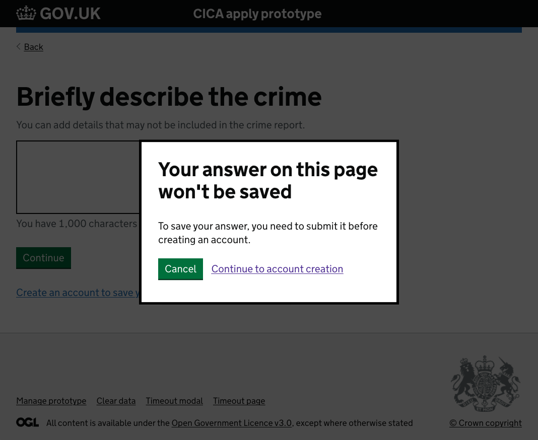
Modal dialog box
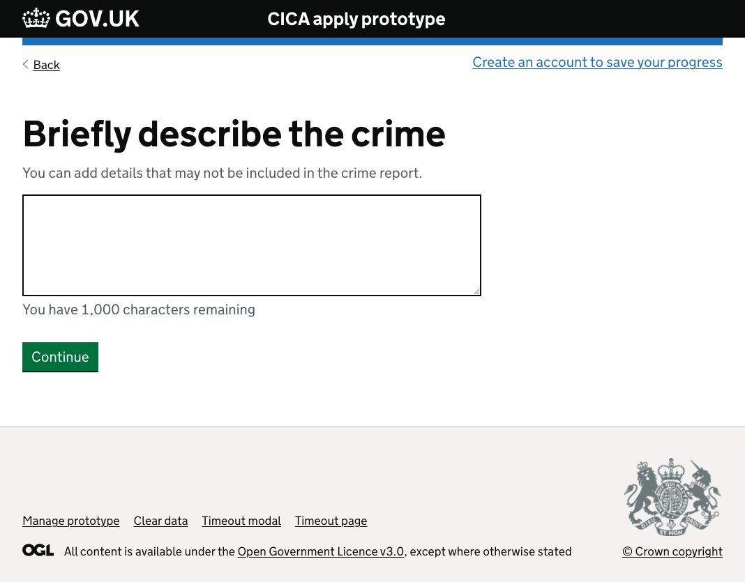
Reposition the link
Adding more link text wasn't preferable because explaining to users what won't happen is usually a sign that the approach will go against their mental model. Implementing a modal dialog box would have been much more technical work, and would also risk confusing the user about exactly what would be saved.
So repositioning the save link was my preferred approach because it was an easy fix, plus distancing the link away from the form would subtly suggest that the link is not tied to the form. For non-sighted users, the 'save' link would also be declared prior to the form, which would solve the problem for them.
Returning to an application
The main problem with returning an application was that the return journey wasn’t clearly signposted on the GOV.UK guidance pages. I added an alternative link to the ‘make a claim’ page so that users have an option to sign straight in. However, some users may miss this link, so I added a radio button option to the first service page. Both return options are shown in the following video.
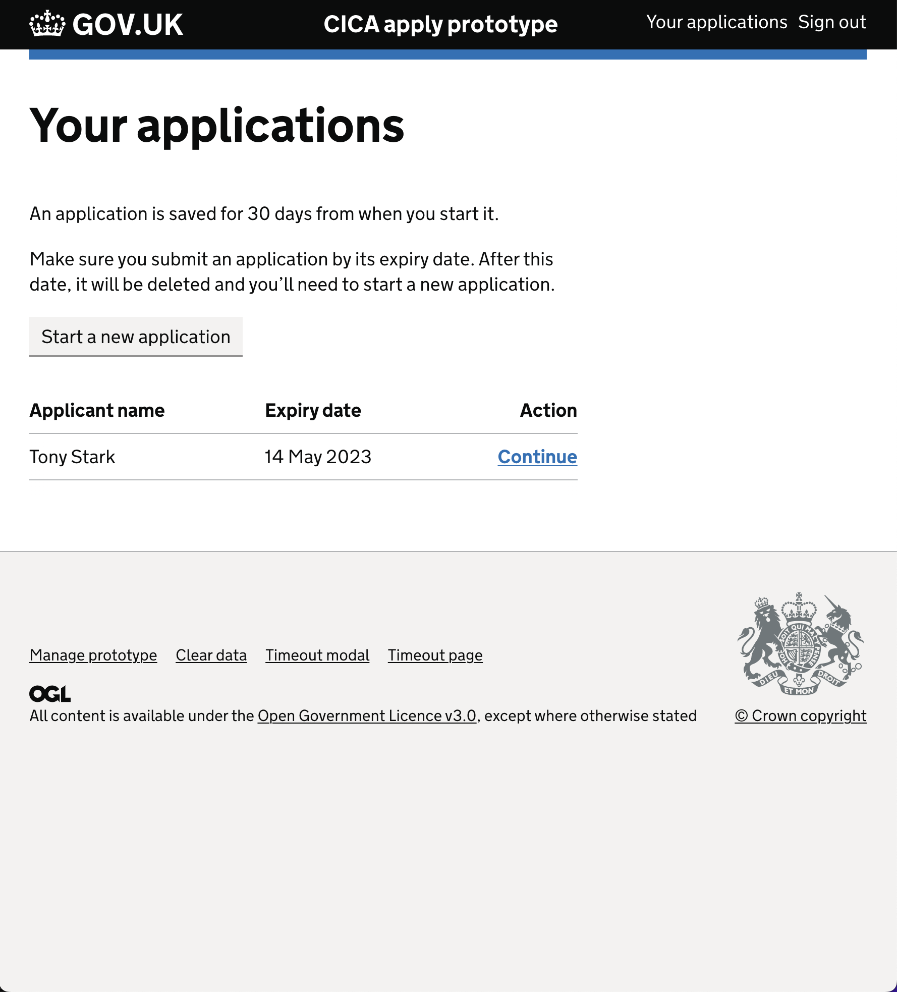
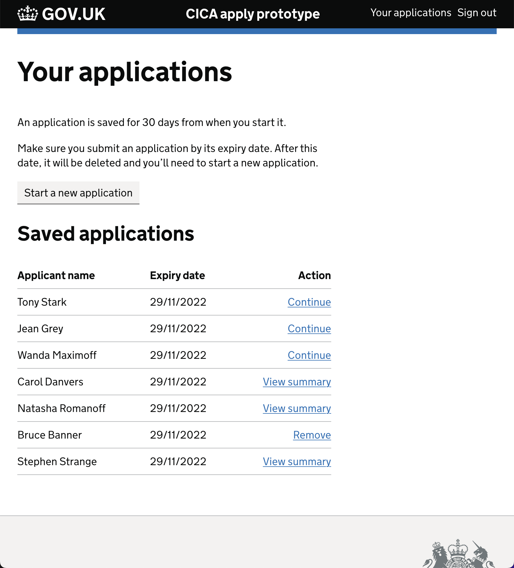
Dashboard design
Given that the service needed to accommodate different user types, some of which would need to manage multiple applications, those users would need a dashboard to navigate between applications. The main user groups that would benefit from the dashboard were legal professionals and third party representatives.
Self-applicants typically only make one application at a time. However, self-applicant could still benefit from it because:
- it would prevent people from accidentally creating multiple applications
- it would remind them when their current application expires
- we could use it to give status updates about their claim
Typical self-applicant
Typical third party support
Prototyping
I built a number of prototypes in code throughout this project using the GOV.UK Prototyping Kit — one for each model plus iterations for each one.
I worked with a researcher and a content designer to finalise designs and create a plan for each round of usability testing.
Having all the approved content, UI designs and journeys built out in a hi-fidelity prototype helped with passing work over to the developers. The prototype paired with the user-flows gave a complete picture of what they were supposed to build and how fine-grained interactions would work.