The Modern LPA
Introduction
- Organisation:
- Office of the Public Gardian
- Sector:
- Public
- My role:
- UX Designer
- Responsibilities:
- Workshop facilitation, interaction design, prototyping
- Phase:
- Alpha
While Lasting Powers of Attorney (LPAs) can be drafted online, they are ultimately paper documents that must be signed with a wet signature by a number of parties. This makes LPAs logistically difficult for users. The current process requires the Office of the Public Guardian (OPG) to process and store tonnes of paper.
The problem
LPAs need to be fit for the future, meaning that the process must be simple and secure for users, manageable for operational staff, and kinder on the environment.
- How might we have more assurance of each user’s identity?
- How might someone sign an LPA digitally?
- How might someone witness a digital signature?
- How might we remove cognitive load from such a complex process?
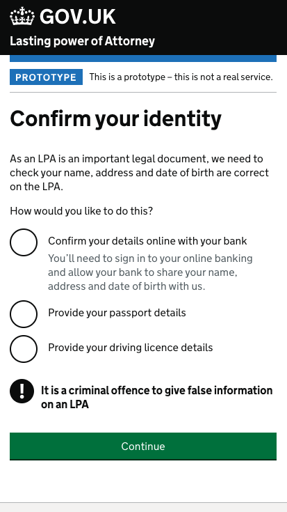
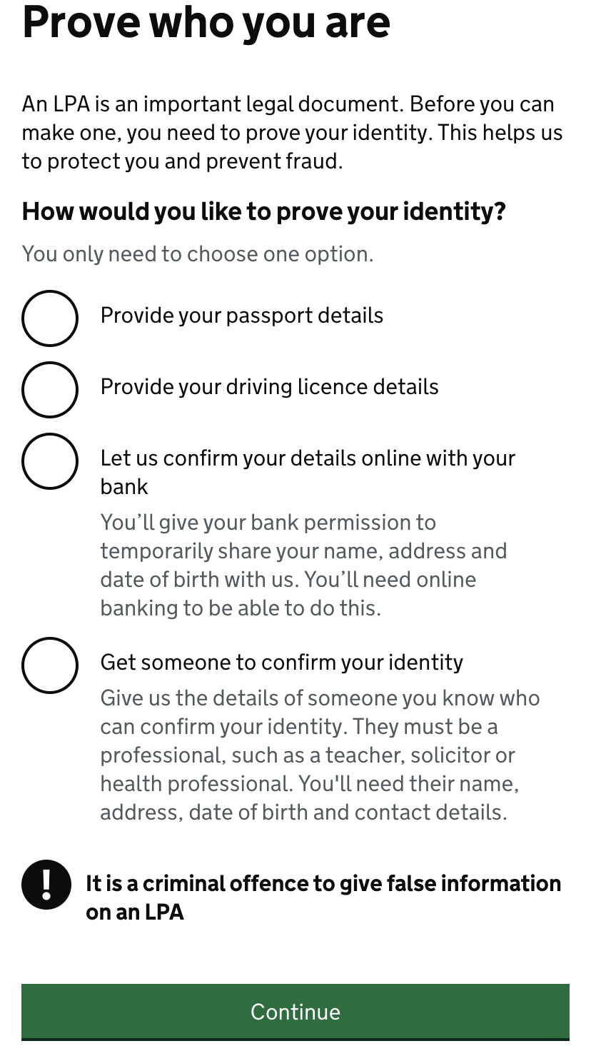
Digital identity
There is currently no identification process on LPAs meaning that a claimed identity is taken on trust. A modern LPA should protect the identity of its users and prevent fraudulent and counterfeit claims.
I sketched a number of ways to prove identity, including:
- a passport check
- a driving licence check
- a bank account check (via open banking)
- connecting to a Universal Credit account
- connecting to a Government Gateway account
- knowledge based verification
- get someone to vouch for your identity
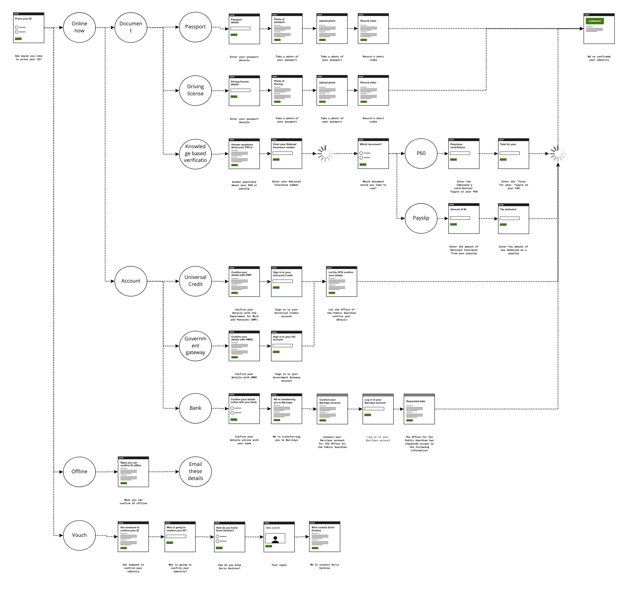
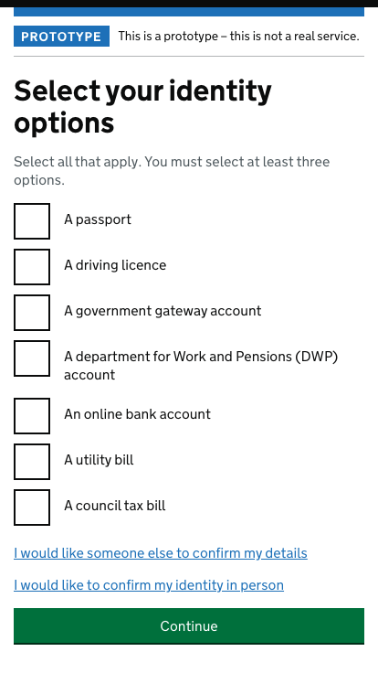
Inclusive identity options
The main objective for the ID section of the journey is to provide an inclusive set of options so that every person has at least one means of being identified successfully. It is possible that some people won't have a driving licence, won't have a valid passport, won't do online banking etc. so we included an option to get someone within a list of professions to vouch for you.
Offline options have also been included for users with lower digital literacy, who might prefer to use the paper process.
Identity iteration
During my time on the project, I designed ten iterations that we tested with users. Here are some screenshots from four of the versions we tested:
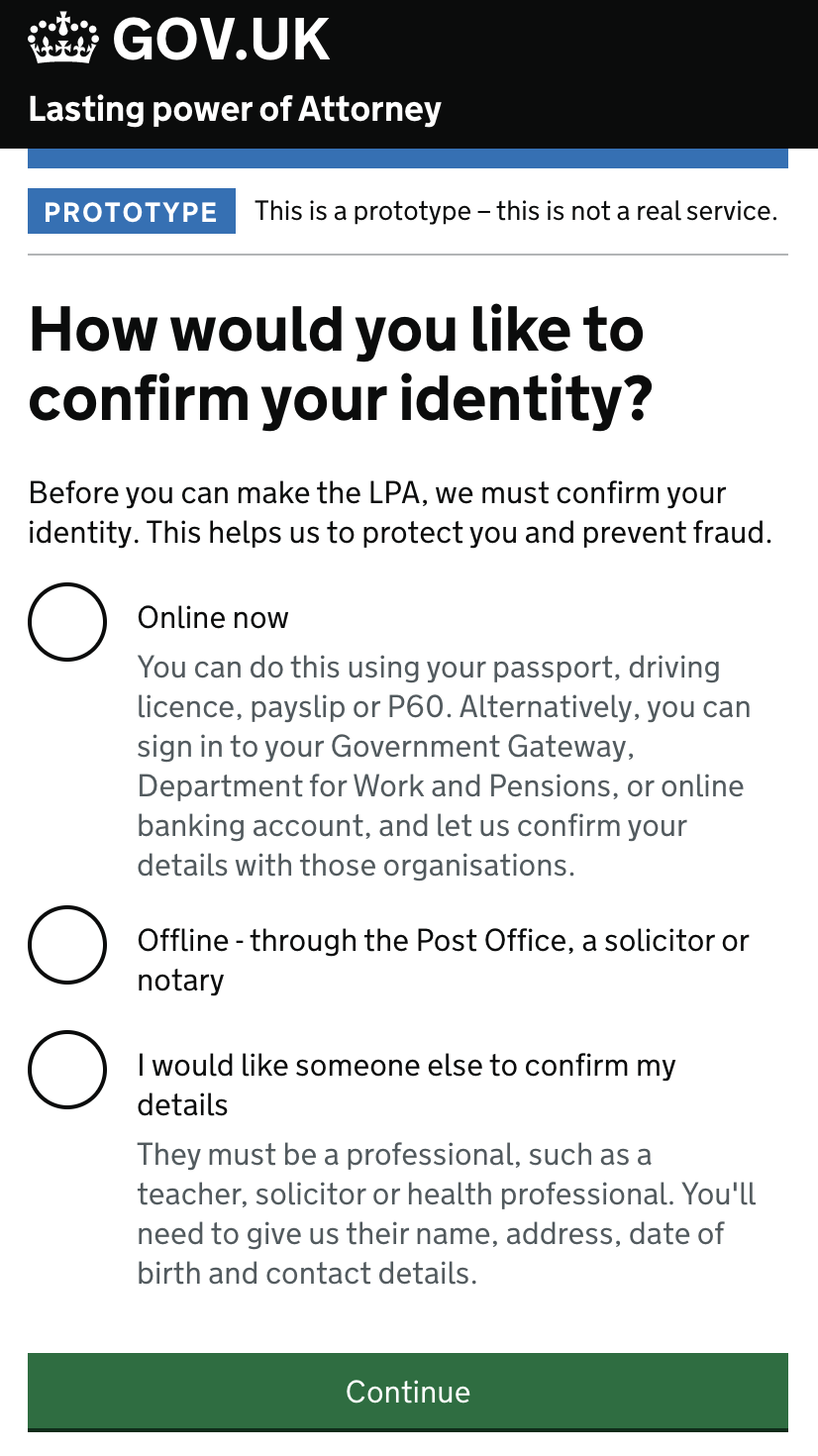
The solution we eventually chose was based on a pattern that Government Digital Services had been using in conjunction with their own identity work. It works by asking the user which options they have and then the system picks the option(s) that give the highest assurance.
Here's a video of a possible journey through our prototype:
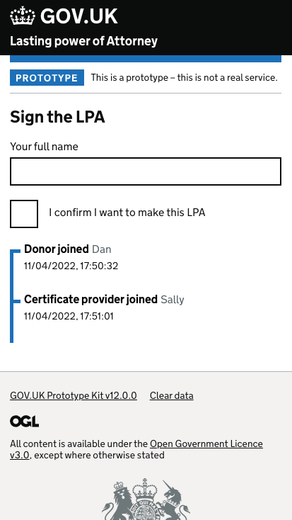
Digital signature
This was by far my favourite problem to solve. Signing a piece of paper with a pen in front of a witness is an interaction for which most people have a strong mental model. But what happens when we take that interaction and put it online? Assuming that most users won't have a stylus to literally sign their screen, this gave rise to the question of what the signature interaction would be.
I explored four possible interactions:
- Type your name
- Check a box
- Voice signature
- Secure code signature
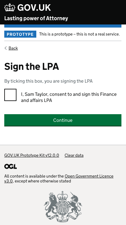
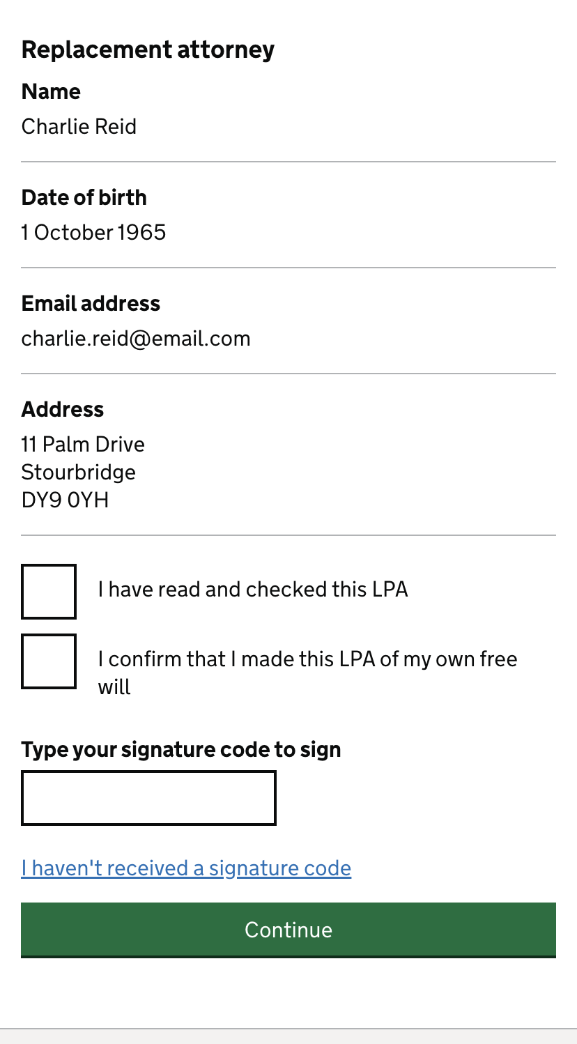
Signature research findings
We tested these signature interactions over multiple rounds of research, iterating each time we learned something. At the end of this testing process, we came away with the following learnings.
- Typing your name didn't feel 'official' enough
- Checking a box is super easy
- A checkbox feels 'official' when it's written as a declaration
- There were many accessibility problems with voice signatures
- People wanted to be able to see their answers at the point of signature
Witnessing
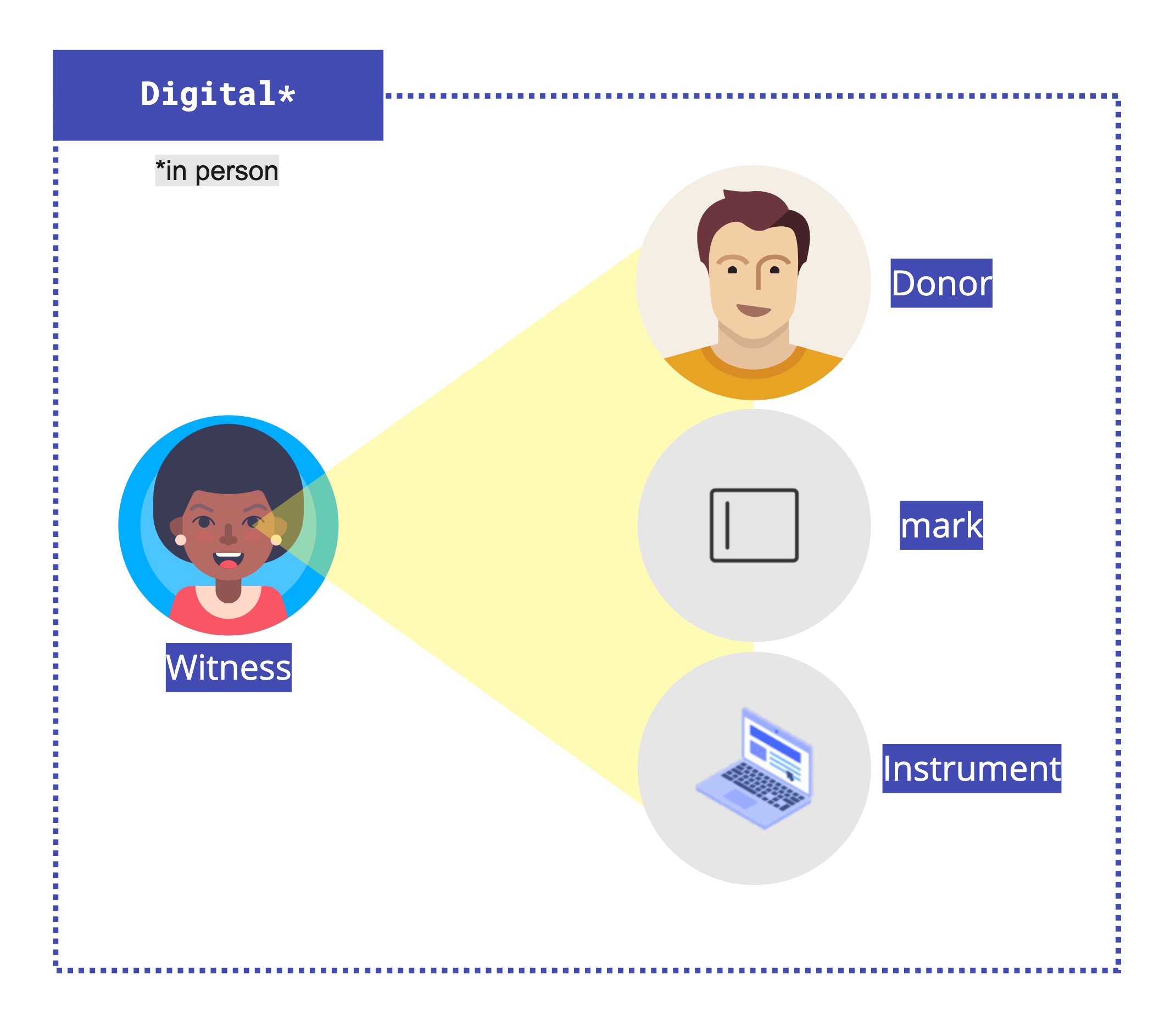
Remote witnessing was off the table for legislative reasons, so the two options to explore were to retain an in-person witness or replace the witness with technology.
Witnessing in-person
The in-person option included a number of problems to solve.
- How many devices should be required for the interaction to happen?
- What if there is only one digital device in the room?
- How many users need to be signed in to complete the journey?
- How can we guarantee both actors are involved?
I storyboarded some high-level solutions to those questions:
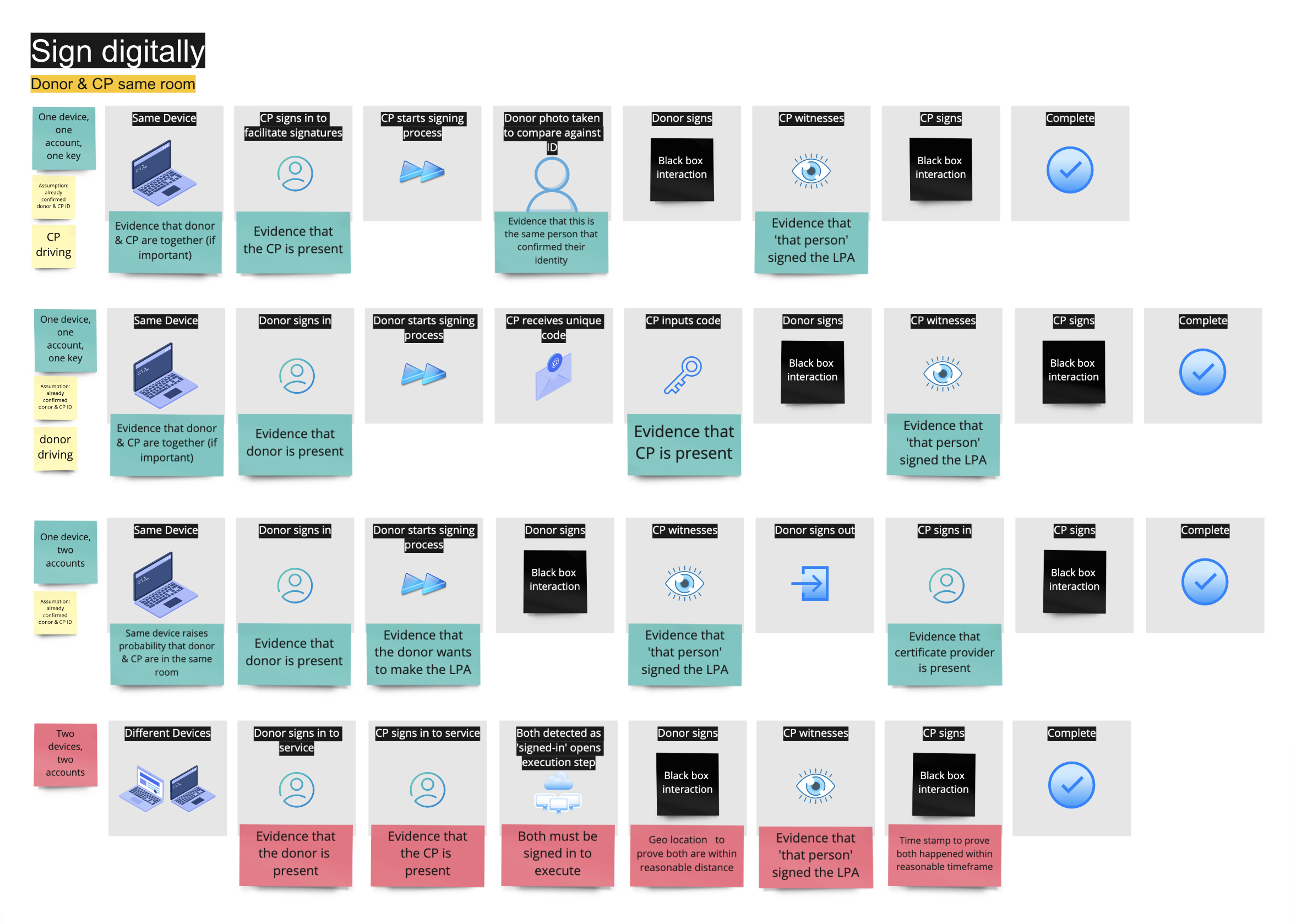
Due to the fact we couldn't guarantee every pair of people who might need an LPA to have access to two devices, my recommendation was to require only one device. However, this would introduce friction if two people have to sign in to their account to sign.
At this point in the journey, the witness would have already created an account and had their identity verified so we could use these to authenticate the witness's identity within the signature session, requiring only the signee to be signed in while giving assurance that the witness is involved and present.
Here is a user journey showing this process:
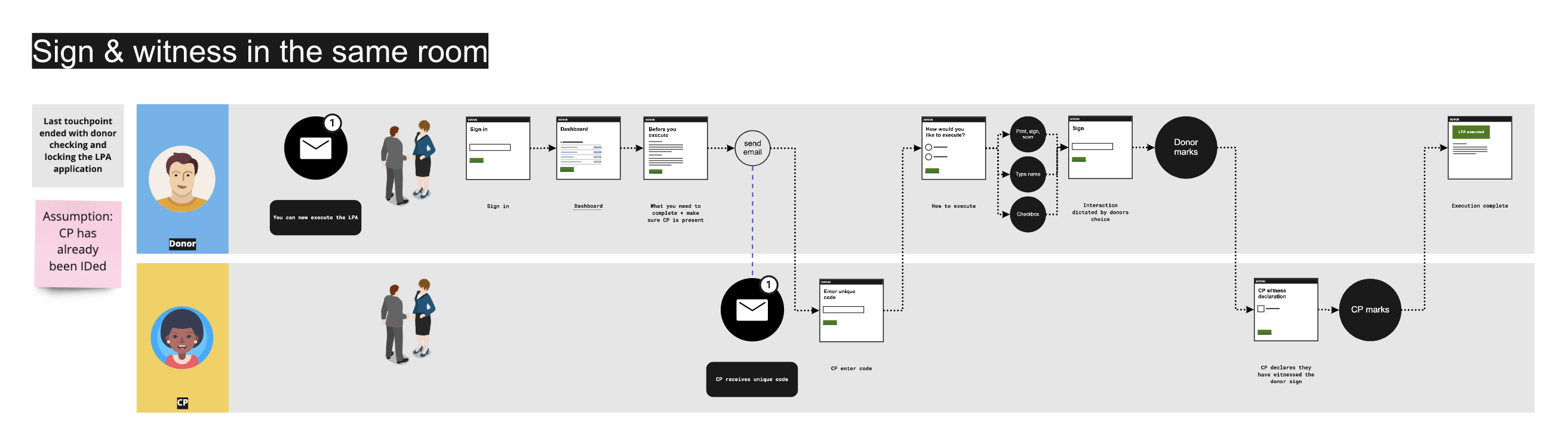
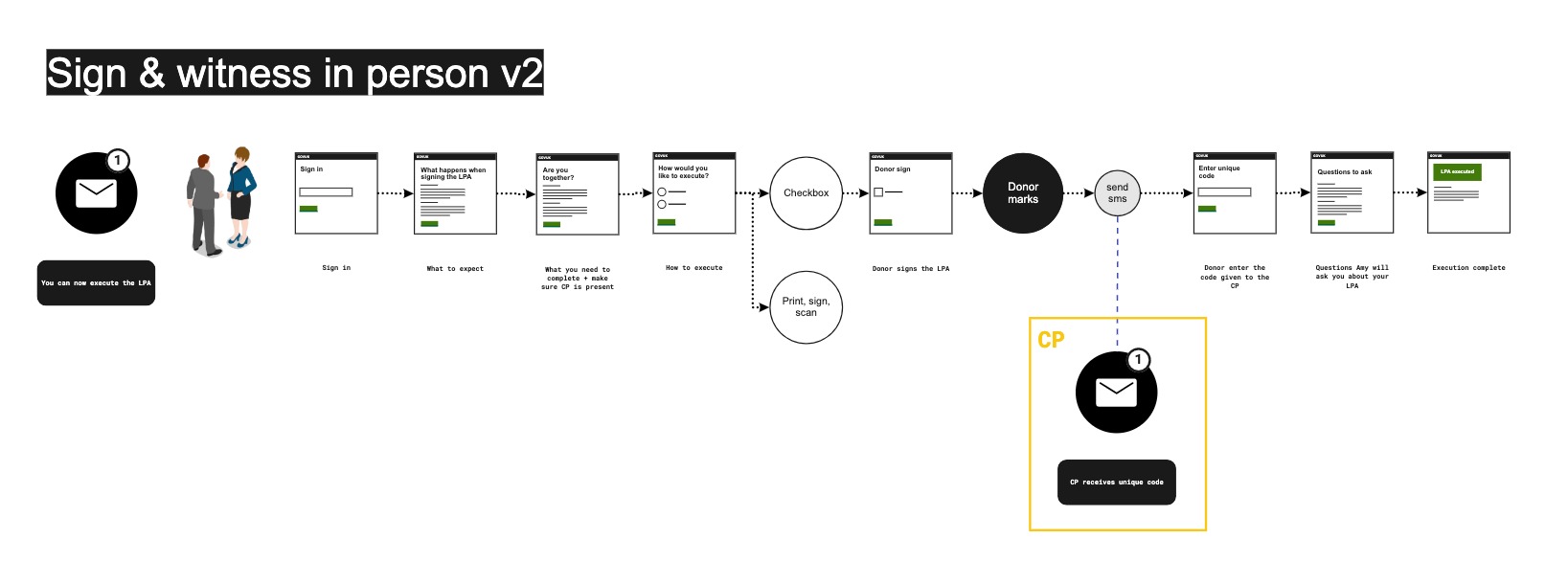
However, during usability testing, users were confused about what was going on and who was supposed to be interacting. We also learned that policy would be happy for the witness to attest later on in a separate session. This meant we could remove the witness touchpoints from this flow.
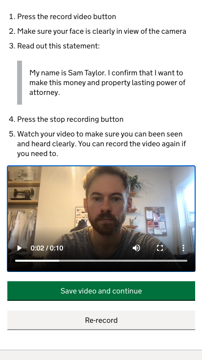
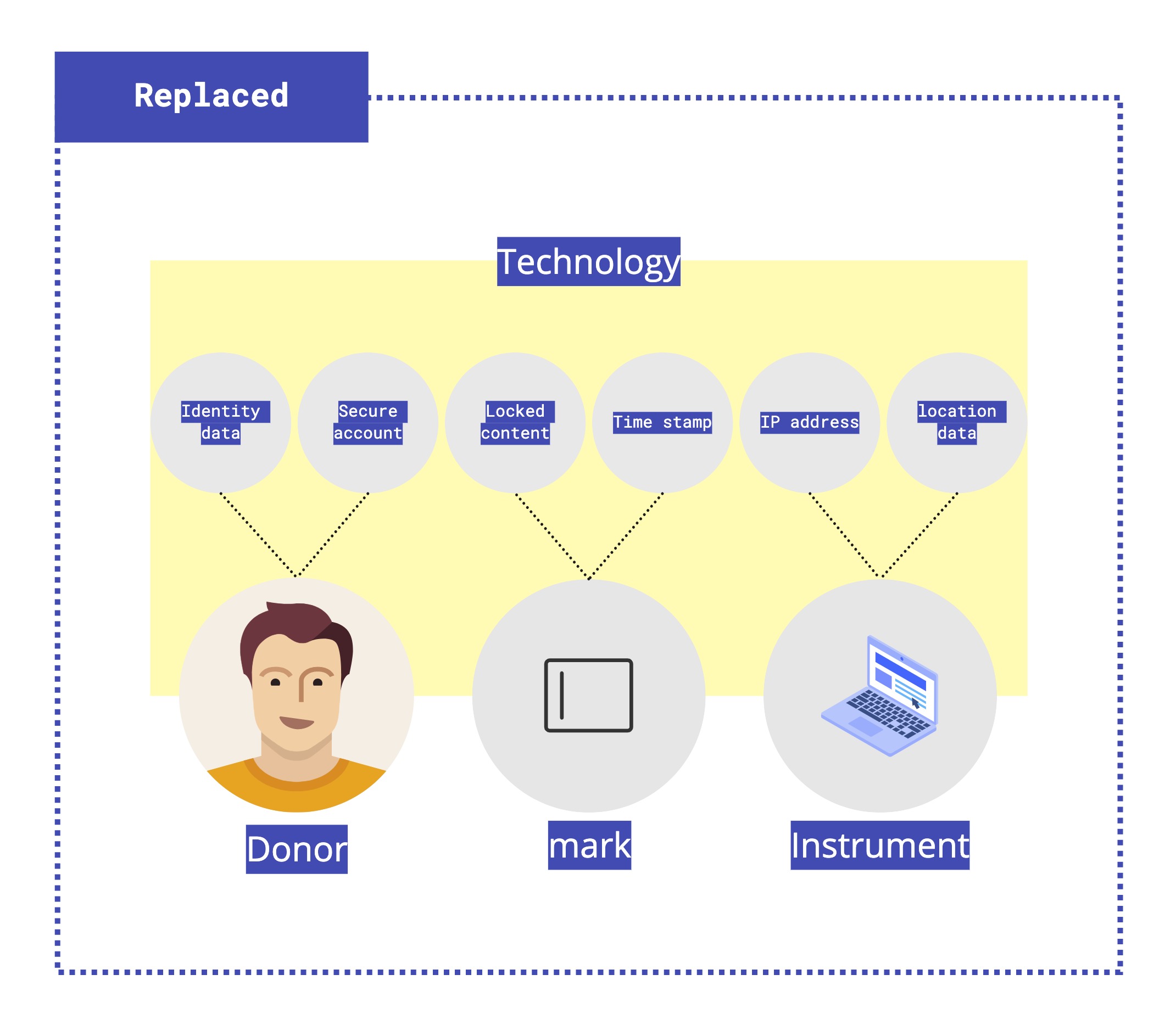
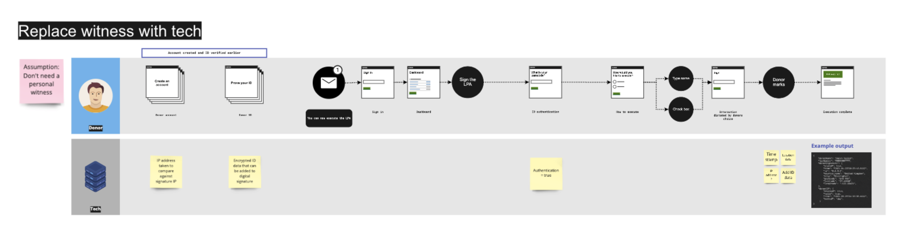
Replace the witness
The other more controversial approach we wanted to test was to replace the witness with technology. This was an interesting approach to design because, on the one hand, signing in front of a witness adds a sense of ceremony and is perceived by some as a safeguard.
On the other hand, finding a witness can be challenging for some, and what value does witnessing add that couldn't be achieved with technology? Especially in a system that verifies ID.
Due to the complexities introduced by witnessing in person together with the fact that witnessing isn't a strong safeguard, replacing the witness with technology was by far my favourite option. It also made for a much simpler user journey, free from interruptions and hand-offs with other actors.
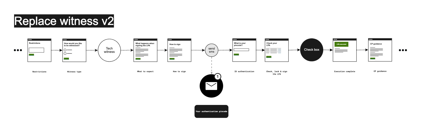
In usability testing, I learned that people preferred the checkbox signature to the type name signature. I also learned that people wanted to see a summary of the LPA on the sign page, so I iterated the journey as follows:
Removing cognitive load
Handling logistics
Most transactional services require one one user to get the job done. However, creating an LPA is more of a social document, involving at least three but often more people.
When making an LPA, there are important hand-off moments where one user needs to have completed a task before the next person can start theirs. For simplicity, here is a high level diagram of a case involving the minimum number of three people.
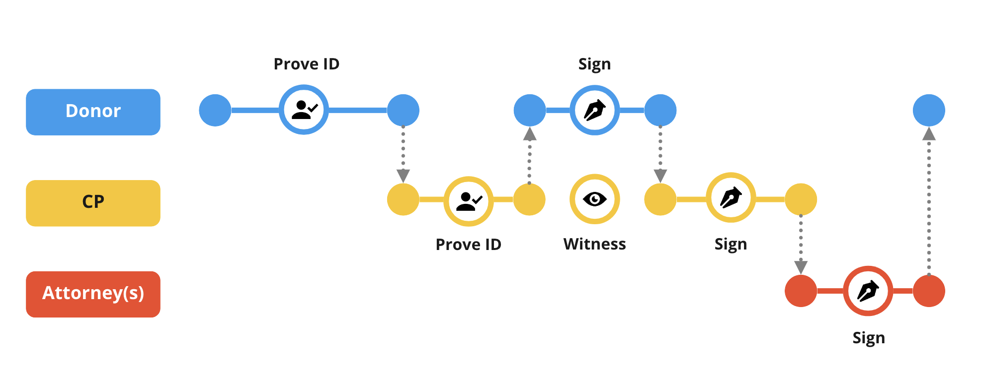
Each dotted vertical arrow represents a notification that the service sends out to whichever users needs to interact next, removing that cognitive load from the user.
I felt it was important that the system deals with the logistics so that the users don't need to. These logistics could make a hard process impossible given that making an LPA is a complex and often an emotional process.
Showing progress
Within each touchpoint, we used a task list to help users progress through the service. This doubled up as a progress indicator as well as reorienting users each time they signed back into the service.
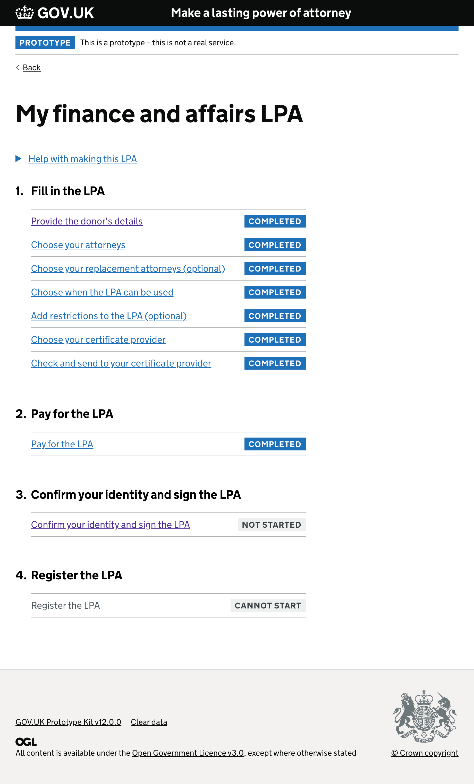
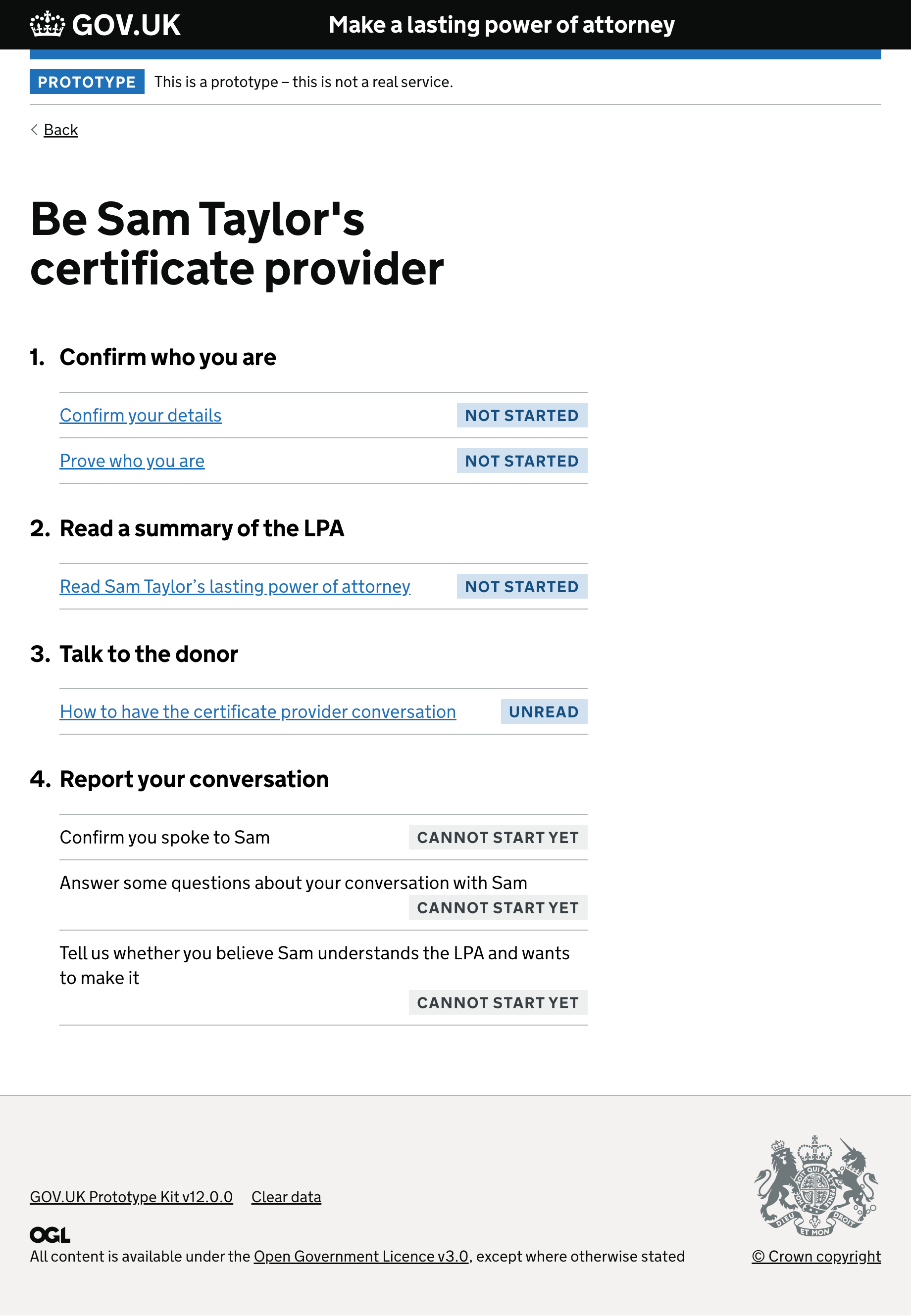
Throughout the project, I designed many iterations of the task list. Through usability testing, we learned:
- People want to see all steps, not just the steps they need to do in that touch-point
- People get overwhelmed if too many steps are shown
- Only show steps that are actionable
- Don't show steps that need to be actioned by a different user
- Task list is less overwhelming in a two-thirds column than full width
Conclusion
I moved on from this project just after passing an Alpha assessment in order to move into Beta. Government services are put through assessments as part of a peer review quality assurance process. The work we carried out in Alpha was instrumental in changing legislation to make LPAs fit for the future.