E-commerce Usability
Introduction
Improve usability of an e-commerce website to drive conversion and revenue.
- Organisation:
- CEWE
- Sector:
- Private
- My role:
- Web Designer
- Responsibilities:
- Workshop facilitation, user research, UX design, wireframing, pattern design, front end development
- Phase:
- Live
Research
Objectives
- Identify typical sticking points within the mobile product purchasing journey
- Discover best practices and competitor solutions to product editor software
- Improve usability of website and product editor
- Check for bugs in Chrome, Firefox, Safari and Edge
- Improve conversion rate
- Drive revenue
UX Walkthough

We started the project with a team UX walkthrough. The group included six people and a note taker.
We mapped some common journeys using a mixture of links and the navigation to navigate through the site. We proceeded together looking for bugs and issues while the note taker logged issues.
Devices used included: an iPhone 5s; an iPhone 6s; an iPhone Xr; a Samsung J5; and a Samsung J5.
Usability testing
I conducted six rounds of usability testing with participants recruited through an agency. I wrote a script and prepared two tasks to take each participant through.
Task one was to choose a product from our wall-art category, and add a photo to it in our product editor. Task two was to repeat the same steps on a competitor website.
Two key insights I gained were that:
- users were getting stuck choosing between our online and downloadable product editors
- there were too many features in the online editor—some of them rarely used
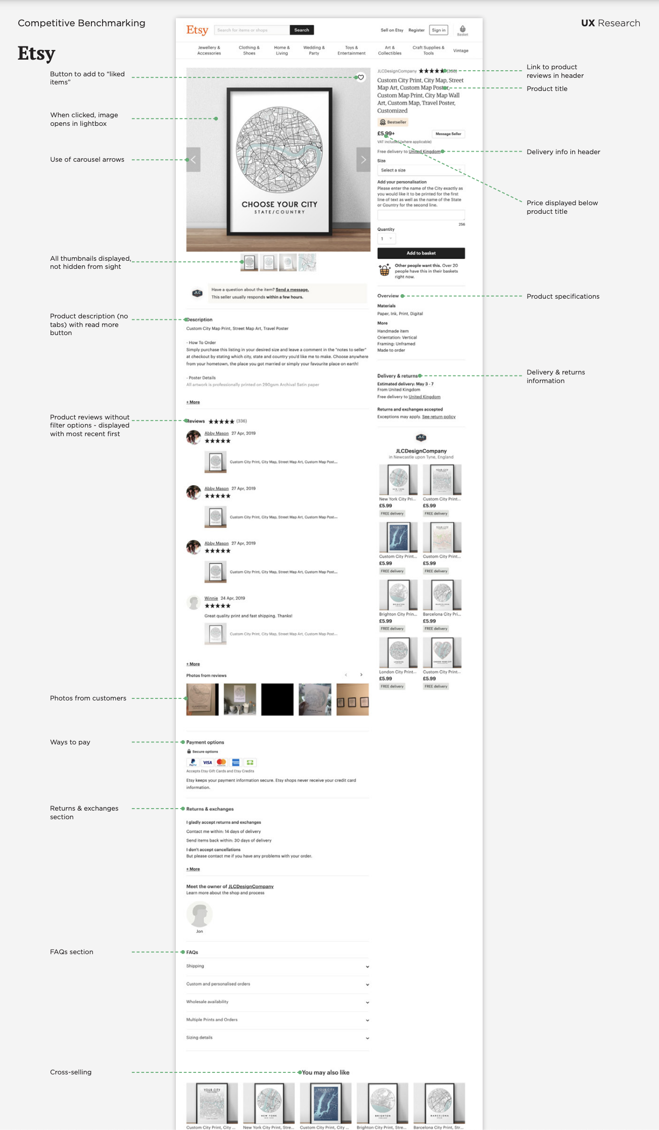
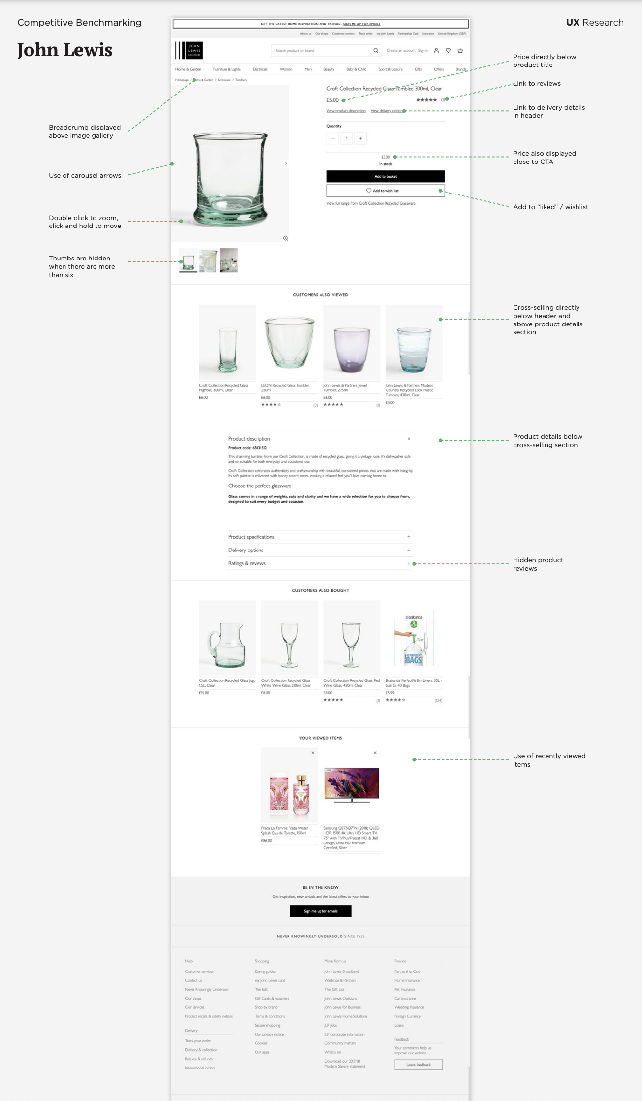
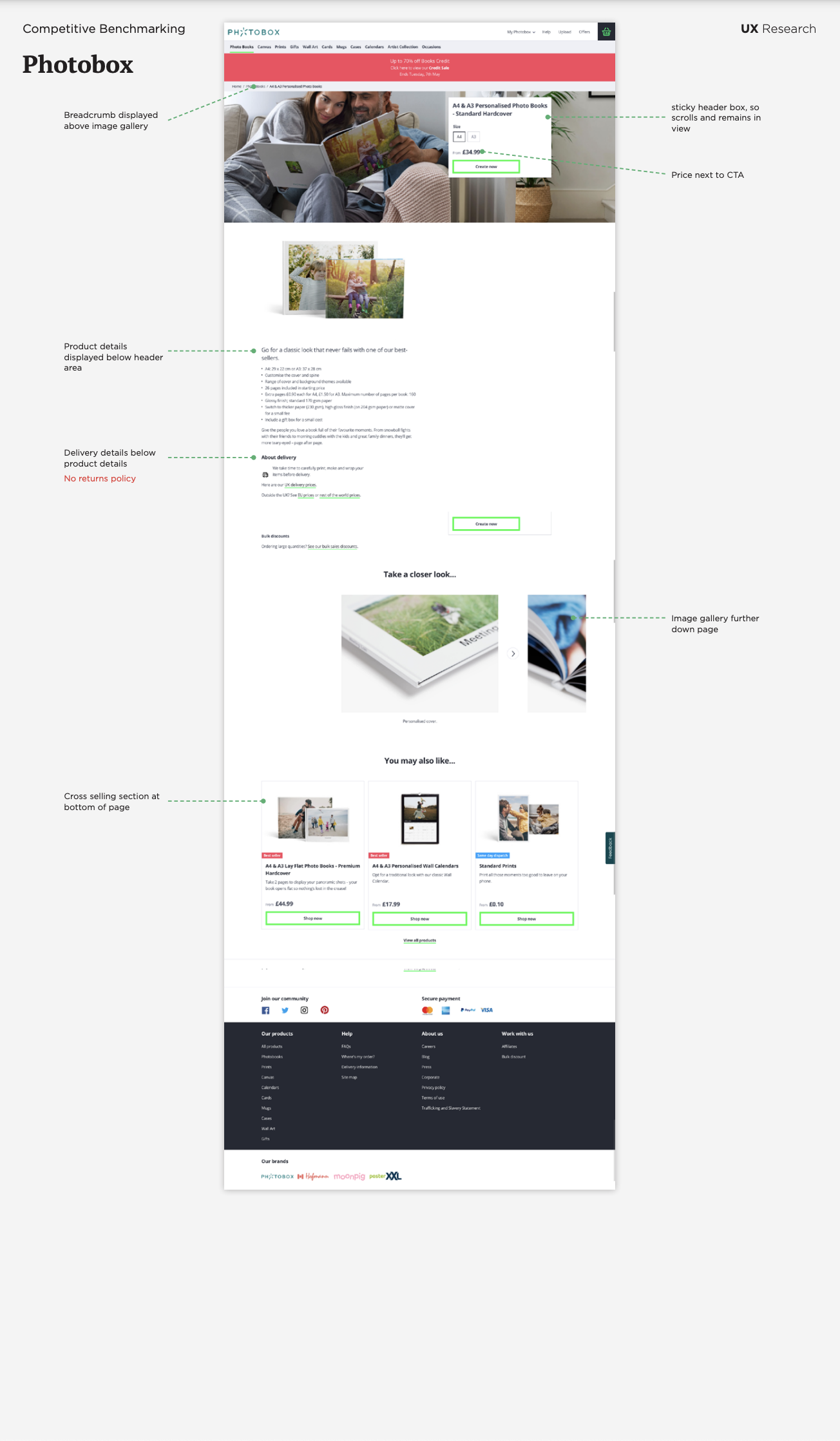
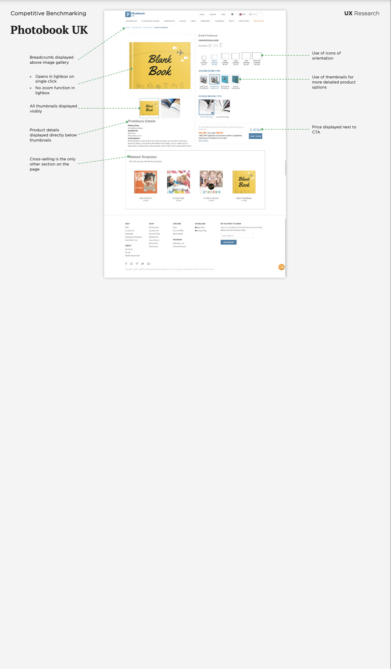
Competitive Benchmarking
Product Page
I did some desk research into product pages to identify design trends emerging across websites with lots of traffic. I looked at how product galleries work, what gestures they recognise, whether they use thumbnail images, where the price is located and what kind of inputs are used.
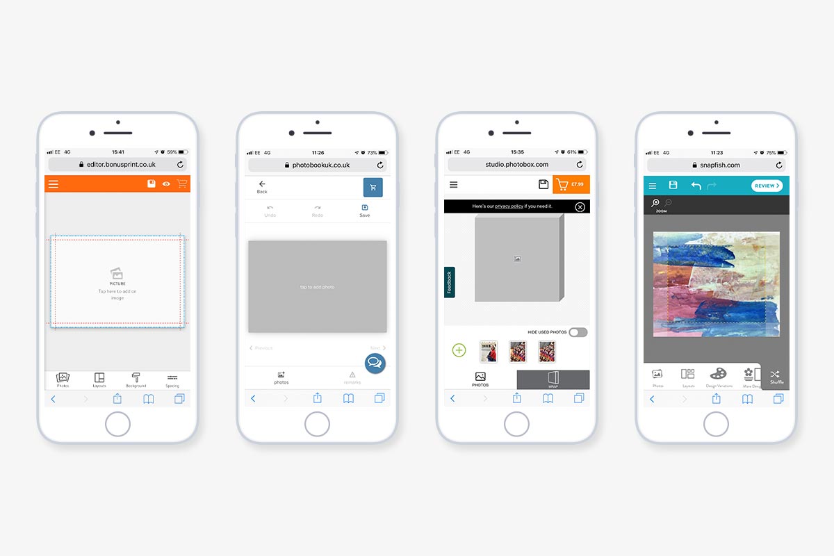
Product Editor
Next, I did some research into how our competitors had designed their product editors. Our editor had not been updated for quite some time and it was clear that we were making things harder for our users than they should be.
All our competitors had product editors that fit onto a mobile screen without needing to scroll. Our editor needed at least two scroll gestures to get to the bottom of the editor.
Our controls where stacked vertically so that you had to scroll down to edit the product. Our competitors all had their controls stacked horizontally so the product could be seen and edited at the same time.
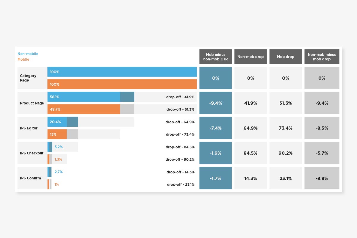
Analytics
I used Adobe Omniture to identify user behaviour and trends. Two points in the journey that stood out to me where users dropping out at the product page and at the first step of the editor. The editor in particular had the highest fallout, so it was clear that this is where the majority of effort should be focused.
Analysis
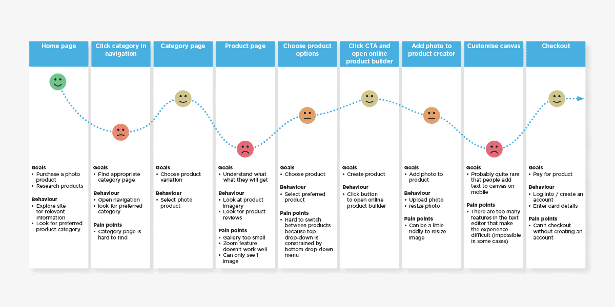
Customer Journey Map
I created a customer journey map based on the notes from the UX walkthrough, usability testing and analytics. The main focus of this customer journey map was to understand the key moments of friction in the journey. Then I could focus my attention on improving those areas.
The three main moments of friction I noticed were:
- trying to locate the product category in the menu
- being unable to understand what the product is like
- editing the product due to too many features
Triage Issues
We organized all of the issues that we found by severity and how simple they would be to fix in order to obtain the minimum viable product.
Design
Low-fidelity & High-fidelity Designs
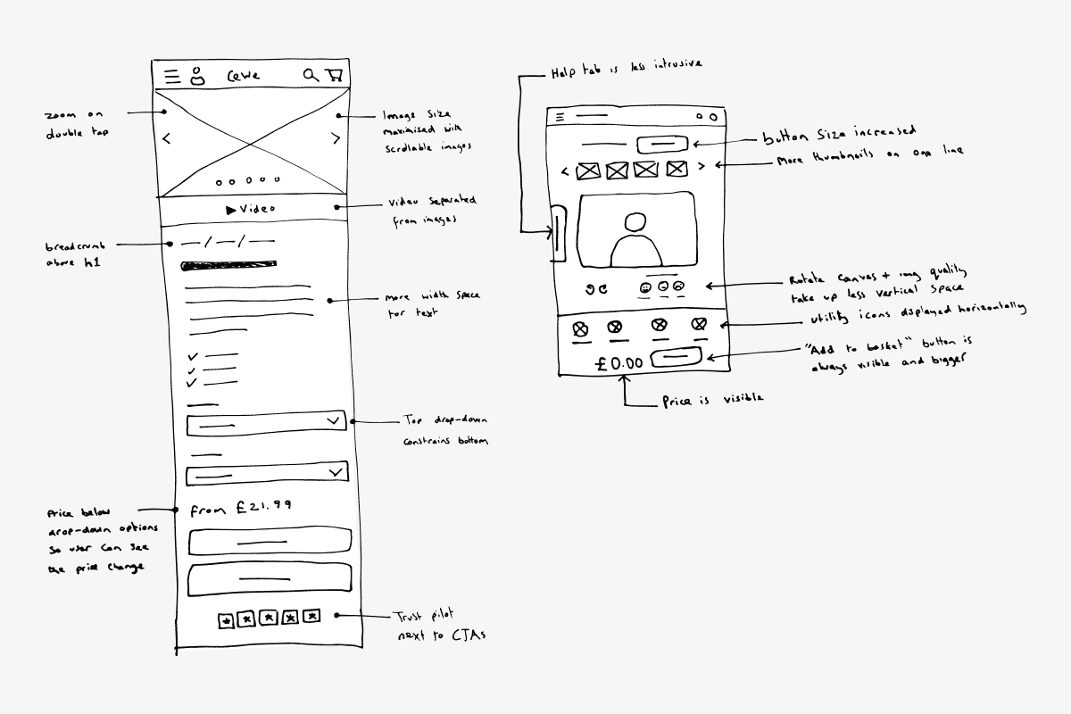
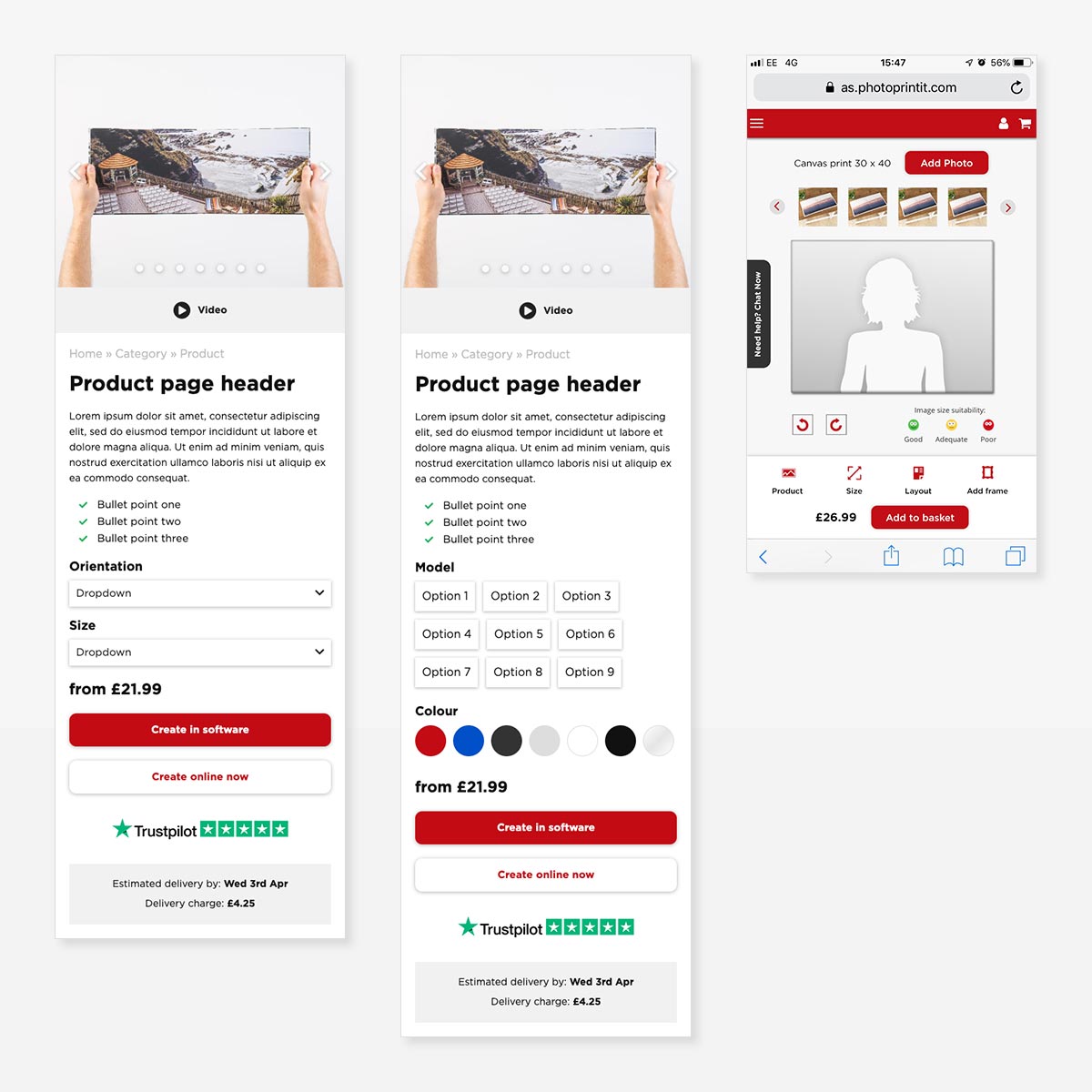
I sketched some solutions to the issues we found above, taking research findings into consideration, and used these sketches to create some high-fidelity designs.
Wireframes
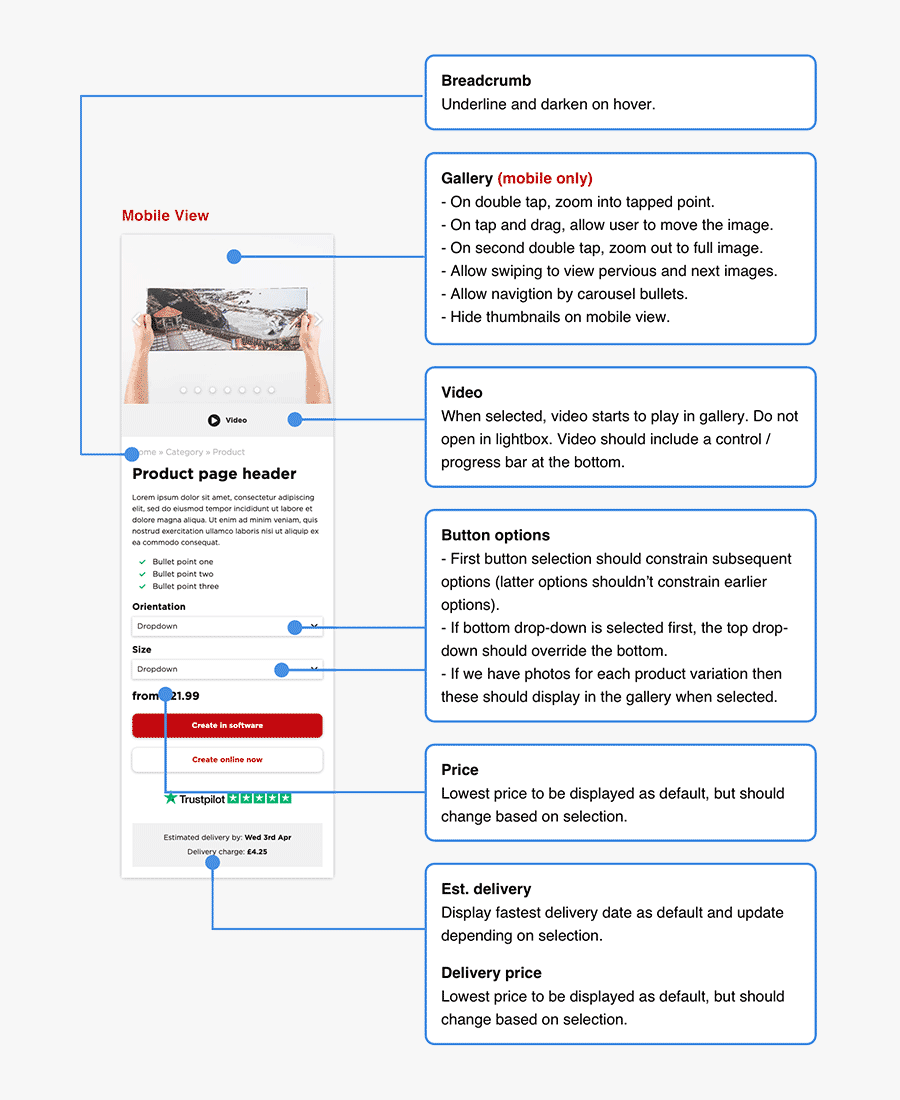
I created some wireframes to pass over to dev for building, explaining how controls behave when the user interacts with them.
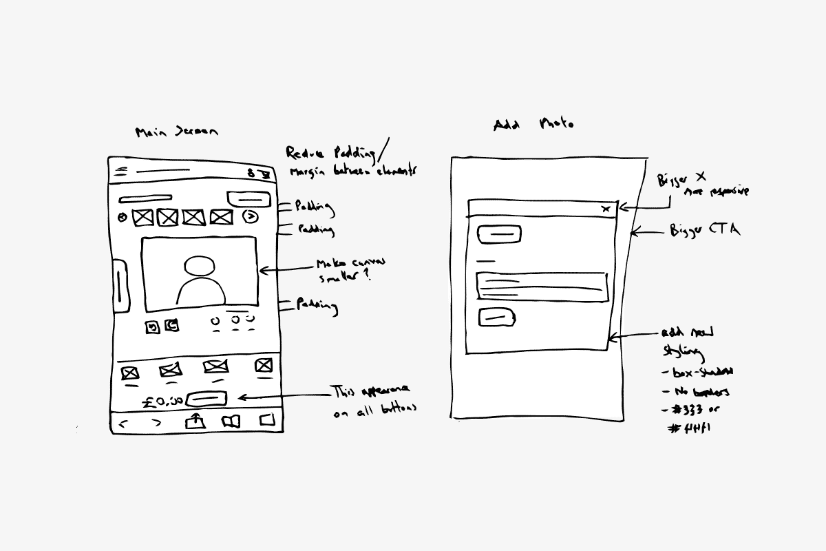
Iterate
Once these changes had been implemented, we did two more rounds of device testing to streamline the product. We logged issues as a team and I sketched improvements each time to pass back to the dev team for the next iteration.
Due to the fact that there was an existing product that had know issues, we iterated directly on the live product rather than spending extra time and resource on building a prototype.
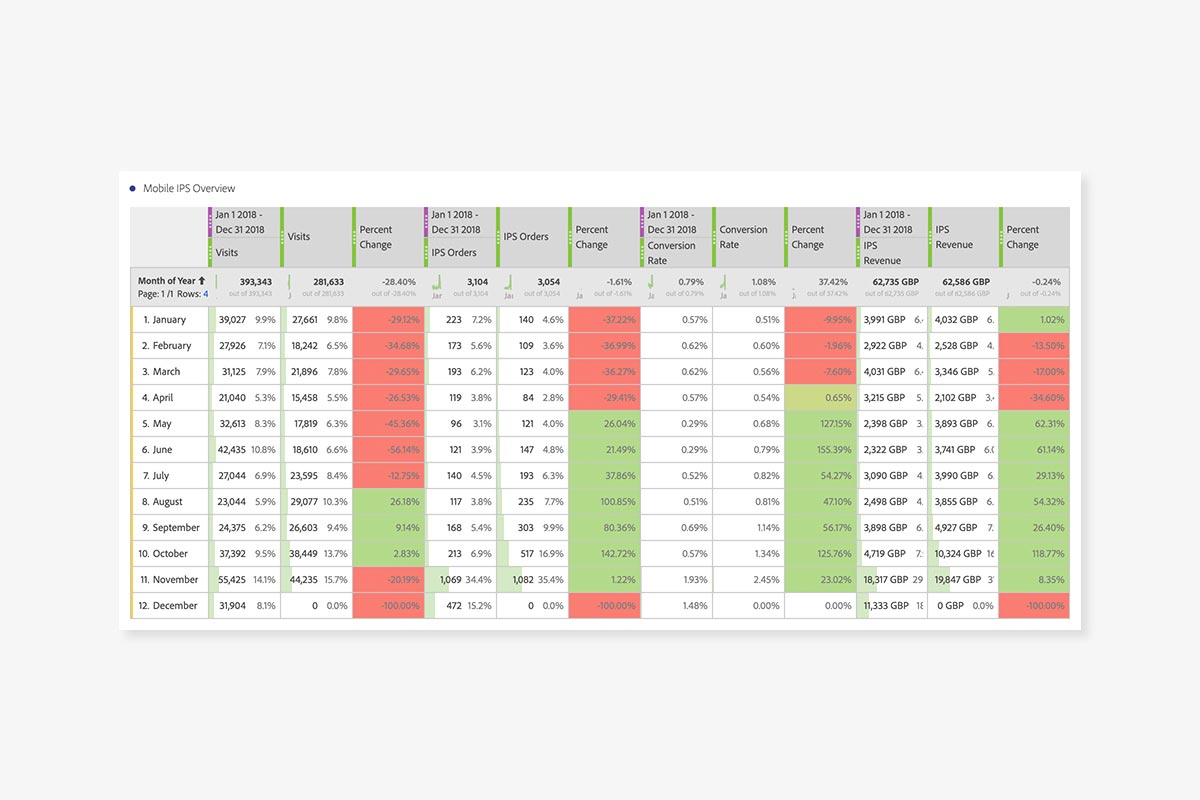
Impact
This work was carried out from March – April 2019 and was implemented at the end of April. Results showed that the impact this work had on the performance of our website, in particular, our online product builder. The table compares visits, orders, conversion rate and revenue from 2018 and 2019. Visits are down in 2019 due to a cut in mobile ad spend, but despite this cut in traffic and visitor qualification, orders, conversion rate and revenue were all significantly and consistently improved by the changes that we made. This is indicative of the fact that usability had been successfully improved by the work that we carried out.